Windows 11: a survey of text boxes

By Sijmen J. Mulder, 3 September 2021

Microsoft is about to release Windows 11 with a brand new visual theme. But yet again within only a few clicks from the login screen a surprising amount of variety (or inconsistency?) is shown.

This also goes for the fundamental text box widget too. Here's a non-exhaustive sample of some that I've encountered so far:

Lock screen

Screenshot of the password field on
  the Windows 11 lock screen. Rounded edges with a blue bottom
  highlight.

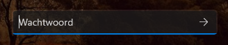
This appears to be the basic new style.

Start Menu search

Screenshot of the Windows 11 Start
  Menu search field. Large, with rounded edges with blue bottom
  highlight.

About the same as the lock screen, but the spacing is different.

Run dialog

Screenshot of the Windows 11 Run dialog. The
  combo box is compact, with square edges and a full solid outline.

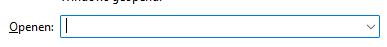
Technically a combo box but wrt. UI design I consider that a version of the text box.

Explorer location field

Screenshot of the location
  field in Explorer on Windows 11. Square edges, spacious, blue
  outline.

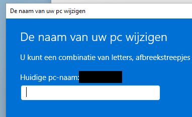
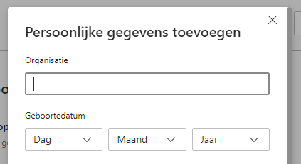
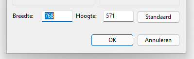
Similar to the Run dialog, but much more spacious.

Explorer search field

Screenshot of the serach field
  in Explorer on Windows 11. Square edges, grey outline.

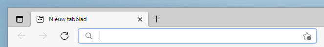
Right next to the location field, and very similar, but now the outline is grey.

Computer name dialog

Screenshot of the Windows 11 computer
  name dialog. Metro design. Text field is white with rounded edges and
  no outline.

Settings search

Screenshot of the search field
  in the Windows 11 Settings app. Rounded corners, highlight on bottom
  edge.

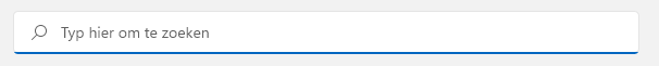
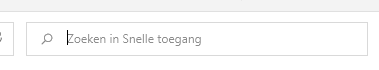
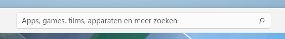
This one is the same as the one on the lock screen but included here to contrast with the search field in the Start Menu, which has different spacing.

Browse dialog

Screenshot of the Windows 11 browse
  dialog showing a combo box for the filename and a dropdown for the
  file type filter. Both square, but different heights.

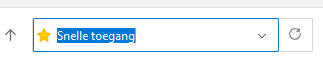
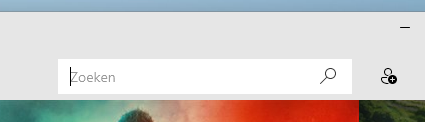
You'd be forgiven for thinking this is the same as the Run dialog, but the internal spacing is different, which you can tell by the cursor.

Also, the height is different from the dropdown right next to it.

Edge URL field

Screenshot of the URL field in Edge on
  Windows 11. Rounded, soft blue outline.

Quite different from the new style Windows 11 text boxes:

(Not to mention the off-center cursor.)

Edge settings

Screenshot of a text field in the
  Edge settings screen on Windows 11. Almost square edges, grey
  outline.

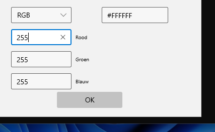
Same app but different place. Now we have almost square corners and a grey outline.

Store search

Screenshot of the search field in
  the Windows 11 Store app. Rounded corners, large font.

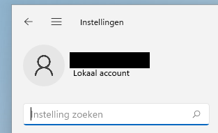
(Shown unfocused.) Mostly the new style, and similar to the Start Menu search field, but:

Moves & TV and Groove Music search

Screenshot of the search field in
  the Movies & TV app on Windows 11. Windows 10 design with square
  edges and no highlight.

Screenshot of the search field in
  the Groove Music app on Windows 11. Same design.

Both of these use the same Windows 10 design with square edges and no focus ring or border.

Paint dialog

Screenshot of text fields in a
  dialog of the Paint app on Windows 11. Compact, with almost square
  corners but also with a bottom highlight.

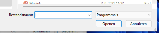
The classic Win32 control seems to have been updated but isn't quite the same:

Also note the large difference in design from this Win32 text box and the Win32 combo box as seen on the Run and Browse dialogs.

Windows Terminal colour dialog

Screenshot of the colour picker
  dialog of Windows Terminal on Windows 11. Slightly rounded corners,
  black border, blue highlight.

Putting aside the messy dialog design, one would expect the new official terminal emulator to be right at home on the new OS, but it uses yet another design.


Feel free to send any comments or suggestion to me at ik@sjmulder.nl.

Back to top